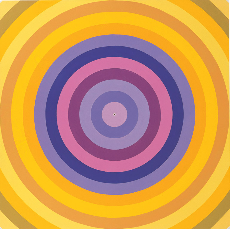
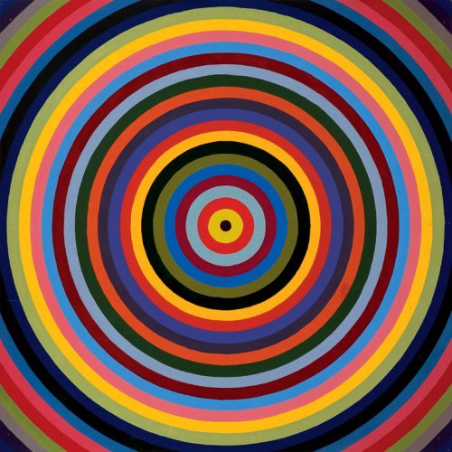
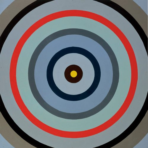
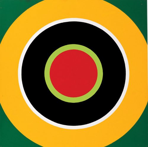
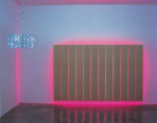
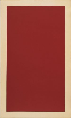
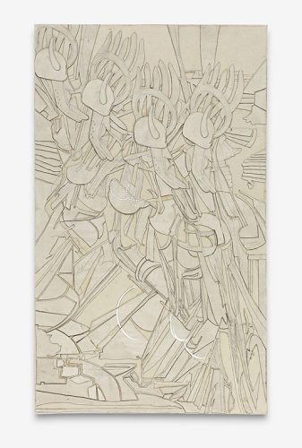
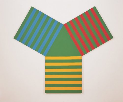
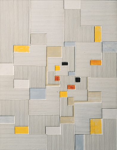
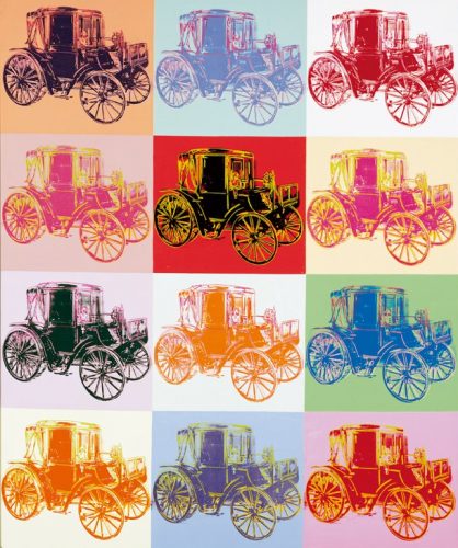
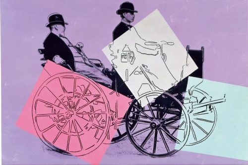
In the early 1960s, Poul Gernes started to concentrate on simple, reduced forms making strong visual effects like circles, stripes or dots in his painting, similar to pop motivs. Most of the approx. 40 Targets painted then were designs for architecture-related works. At first he drew the rings for his Targets in pencil, but later he went over to scratching them into the ground with a pair of compasses. This gave the paintings a relief-like character and created clearly defined color fields. The contrasting color intensities in the circles make each color seem like a distinct, three-dimensional volume. The vivid color combinations of the Targets (shown at the Venice Biennale in 1988) come from sketches or ready-mades like the stripes on a t-shirt. Sometimes Gernes used random systems as well, for example by putting paint pots behind him and dipping the paintbrush into one pot blind. Although it may not seem to be the case, Gernes’ work makes no passing references to contemporary works by other artists.
close
checkout*
Shopping cart
Versand und Abwicklung erfolgt über die Bücherbogen am Savignyplatz GmbH in Berlin. Für Fragen zu Bestellungen wenden Sie sich bitte direkt an info@buecherbogen.com
Handling and Shipping is done by theBücherbogen am Savignyplatz GmbH in Berlin. For questions regarding your order please contact info@buecherbogen.com directly.
*
Bestellungen aus der EU sind bei PayPal auch ohne Anmeldung möglich. Sie können dann auch bequem per Bankeinzug oder mit Ihrer Kreditkarte zahlen.
Für diese Option klicken Sie bitte auf PayPal und wählen anschließend die Bezahlung "Mit Lastschrift oder Kreditkarte" aus.
Buyers from within the EU can use PayPal even without having a PayPal account.
Via Paypal you can also check out with direct debit or with your credit card.
For this option please click on "Check out with PayPal" and make use of the "Payment by Direct Debit or Credit Card".
